IMPROVE YOUR ANALYTICS OR THE UI/UX?
At a client review meeting recently, I caught up with Rob Gardner at the café below Redington’s impressive new office, just a few minutes’ walk from Bank Station in the heart of the City.
Rob was outlining how Financial Canvas can help Redington to deliver their ambitious aim to bring financial security to 100 million people. As we chatted, jotted and sketched, Rob created this delightfully simple grid that formed the basis of our conversation for the rest of the meeting.
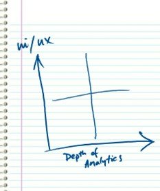
There is a joy in finding these simple visual expressions, often with hidden depths, to articulate your ideas and develop your thinking.
For the un-initiated, ui/ux are ubiquitous acronyms from the tech industry. ui (user interface) and ux (user experience) together deliver the layout and feel of an app to help users engage with, and then understand, the decisions that they need to take.
But style with no substance brings a false sense of confidence. Whilst there is great value in simplicity, we are accelerating into a world of big data and new techniques opening new analytic possibilities. Are you making the most of these opportunities?
We’ve been thinking about this grid a lot at Financial Canvas.
If you are using analytics to help set investment strategy, have you thought about:
“Which quadrant are you in?”
“What about your peers?”
“Is this where you want to be?”
“Which direction is it most important for you to move?
Great focus starts with self-awareness and a clear direction of travel. All from a simple grid…
Looking across the players in the pensions and investment market we see two key themes again and again.
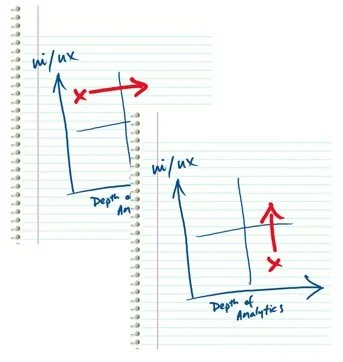
1. Glossy investment tools sitting on a mean-variance calculation. The shortcomings in this approach are well known. Are you properly representing the risks to your clients? Shouldn’t you be taking a step to the right?
2. Sophisticated analysis of the underlying risks but unable to uncover insight from the analysis. Perhaps because analytics are buried in a monster spreadsheet that is too unwieldy to permit interactive exploration.
And often because the focus has been on the analytics and a belief that this is the ‘hard stuff’ with little thought to the final presentation. Not so! Interpretation and explanation are the bigger challenges and all-the-more-so in the consumer market with increased reliance on technology and reduced human influence. Step up!
We’d love to hear your comments and encourage you to reflect on YOUR grid position.
Get in touch if you’d like help working out
where you are
and how to get to
where you want to be!