INTERNING AT SCIURUS ANALYTICS AND EXPLORING FINANCIAL CANVAS AS A TOOL FOR ANALYSING TIME SERIES

My first year studying Mathematics has given me a great foundation to build on, but I wanted to see the maths I’ve learned being used in real-life. Interning at Sciurus Analytics, a start-up based in a lively co-working space in Wimbledon, for a few weeks this summer, has given me insight into the ways I might use my degree once I’ve graduated. I’ve seen daily stand-ups and agile working, as well as had the opportunity to explore applications of mathematics in a business context.
While there, the team asked me to look at this blog post about Facebook’s tool, Prophet, and see whether I could replicate and extend the analysis using Financial Canvas, their interactive modelling and data analysis tool. As with Prophet, you can use Financial Canvas to analyse and forecast time series (as well as a whole load of other funky stuff!). Unlike Prophet, you build models as an ‘executable flow diagram’. This makes it really easy to visualise the whole model, interrogate the intermediate steps and even view and edit the code if you want to. Great for a maths geek like me who wants to see under the bonnet but am still learning how to write good code!
I used the same data referenced in the blog post; Consumer Price Index from 1987 to 2018 (excluding energy, measured monthly and not seasonally adjusted). As in the Prophet blog, I will analyse the data, create an appropriate model, run some simulations, and then look at forecasting using these simulations.
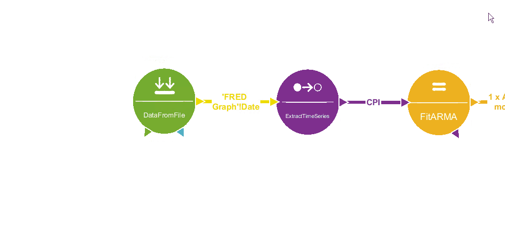
First, I built a canvas model to achieve this. The graphical flow makes it very straight forward to build, review and edit the analysis No coding knowledge is required, but if I want to understand or extend the underlying methods, I can step into the MATLAB code.
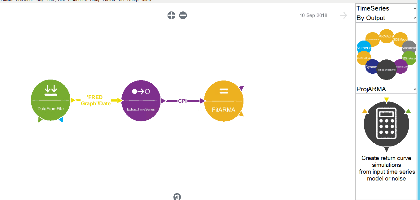
Financial Canvas imports the data and extracts the time series. We may wish to view the data at this stage.
Here are the autocorrelations and a pdf of the distribution I fitted to the return data.
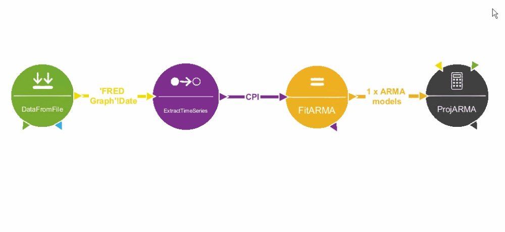
The Prophet blog focused on finding this model, but as Financial Canvas does the hard work for us, I was more interested in how we can use it for forecasting. Financial Canvas has a suite of models (SDE, GARCH etc) and I chose the ARIMA model by looking at the fitting statistics included.
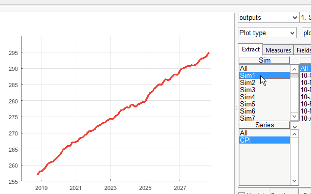
You can see the simulations I ran of what might happen to CPI in the future. below, broken down into a single simulation over ten years, the first 5 simulations, and all the simulations.
A single forecast is pretty but for forecasting purposes is essentially useless . The average of the simulations cannot be expected to always make accurate predictions. Below we can see that instead of a single forecast being plotted, it gives us the percentiles for each month as well as the average prediction across all the simulations.
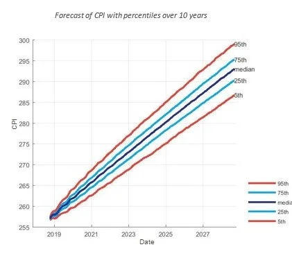
From this perspective, we can say that in 75% of the simulations, CPI exceeded 285 by 2027. If we want to be more specific, we can say that in 50% of the simulations, CPI was within 2.5 of the average (so somewhere between 285 and 290). This is an extremely helpful feature, allowing us to understand our forecasts and the probability of their occurrence (assuming the validity of our model).
Overall, I have thoroughly enjoyed my time at Sciurus Analytics; learning what they do and getting involved. A big thank you to the team for having me.